Designing a sale board is not as easy as it sounds. Someone told me once "It requires a completely different approach than any other marketing material." I followed that advice. Does it have to look the same as the rest of the company image? Not necessarily. Why does it have to be different? It has to be memorable, recognizable and impactful in a relatively short space of time. Usually you have no more than three seconds to get someone's attention, the impact has to be very strong and immediate to make them stop the car and photograph the telephone number. It has to be a statement.
Most of the agents are not paying much attention to design their boards. They just go with the same image as their website, logo - same colours same look - with the contact details on them, and that is it. They don't stand out from the crowd, might be boring, but everyone knows who they are. When you introducing a new brand you need to work 10 times harder, think outside the box to get people's attention. Constantly innovate, know what your competitors are doing and always try to stay one step ahead.
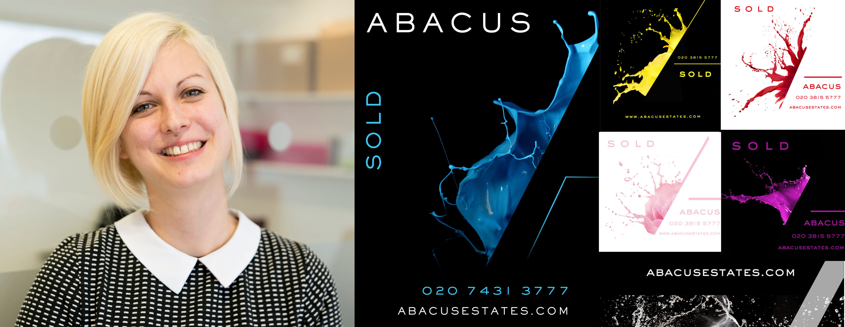
That is exactly why we spent so much time designing ours, we went through so many stages: arguments, testing, hesitation, several versions, and different colour combinations until we finally reached a decision on one design. The blue splash on the black background is the winner. We wanted to take the standard A logo (stands for Abacus) out of the usual environment and create an abstract version of it. The colour splash with the horizontal refining lines seemed like the ideal representation of that shape. We went for the blue, because our old logo used to be blue which also adds a bit of history to the design.
Look out for our new sales boards on the roads. Careful they might still be hot as they just came off the printer:)